
A tribute to everybody’s favorite wall-crawler

A quick illustration based on someone seen in a bar window

A character / texture study based on a bear and romanesco broccoli. Who knew food could be so fractal?

Interior study focused on capturing the warm colors of summertime.
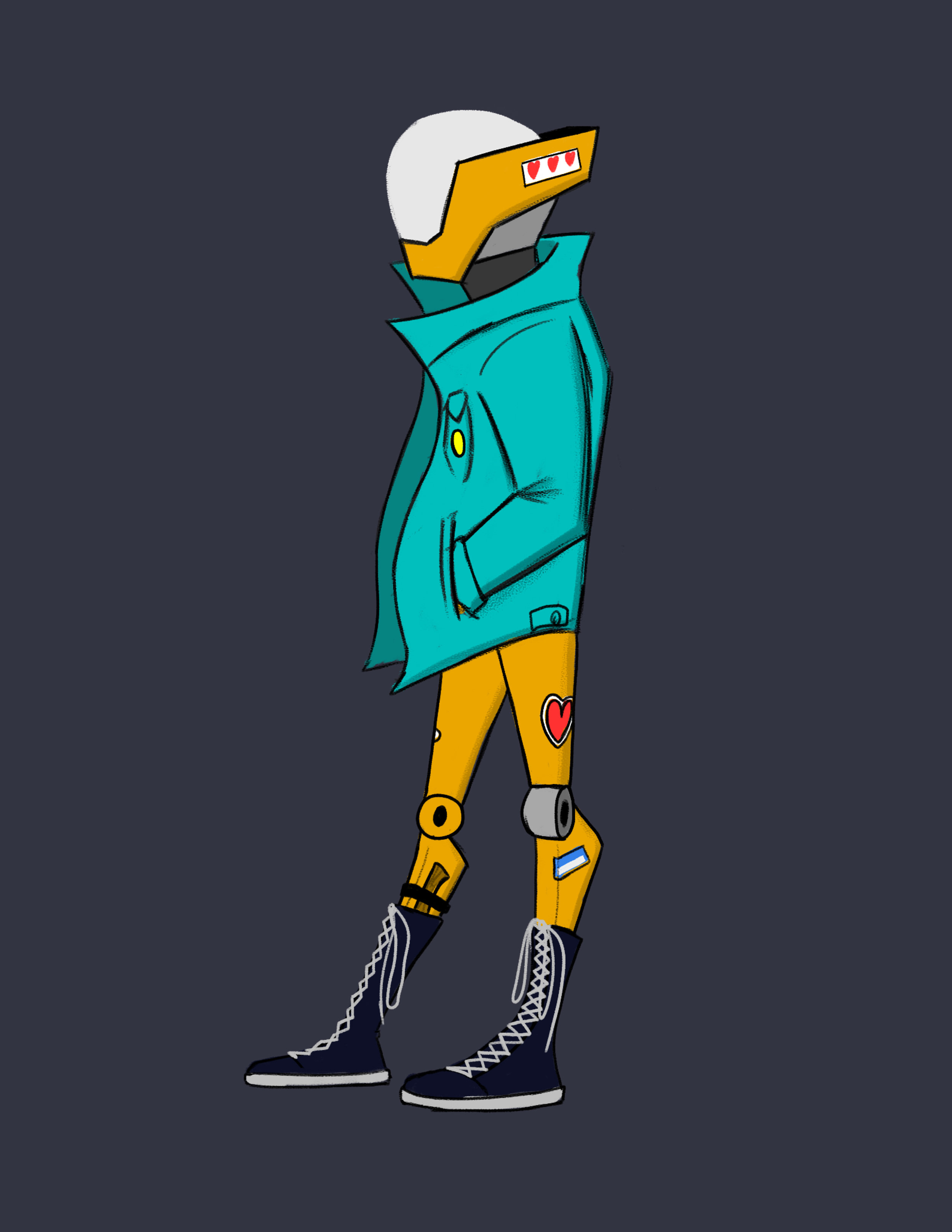
Character concept created as part of a production pitch. This guy may be made of metal, but he loves a cool jacket.
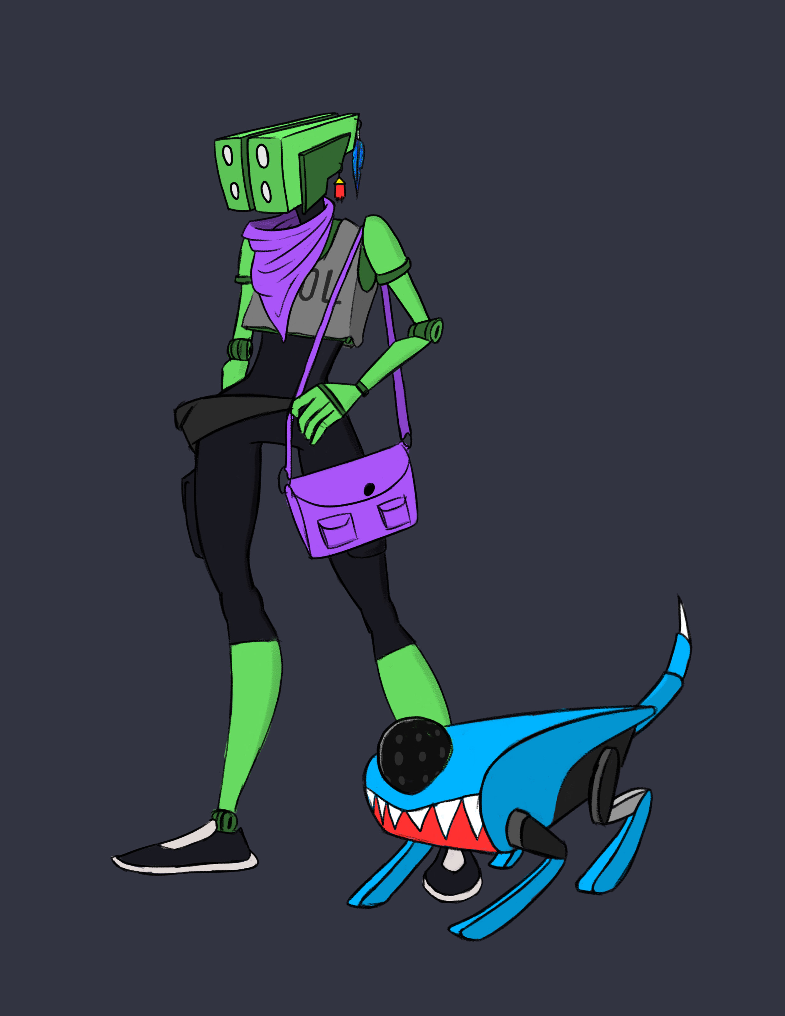
Character concept created as part of a production pitch.
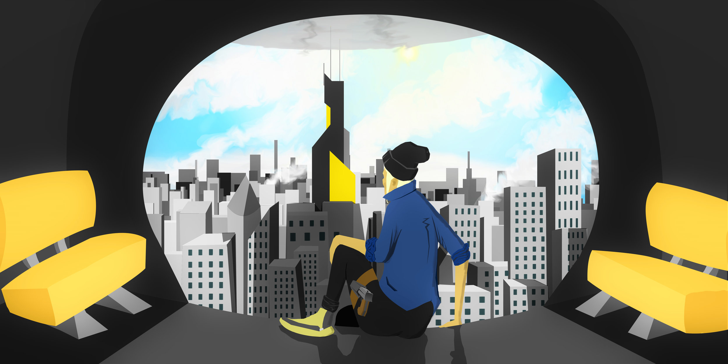
Concept art generated for a dystopian sci-fi thriller. The city may look pretty, but it hides a lot of dark secrets.
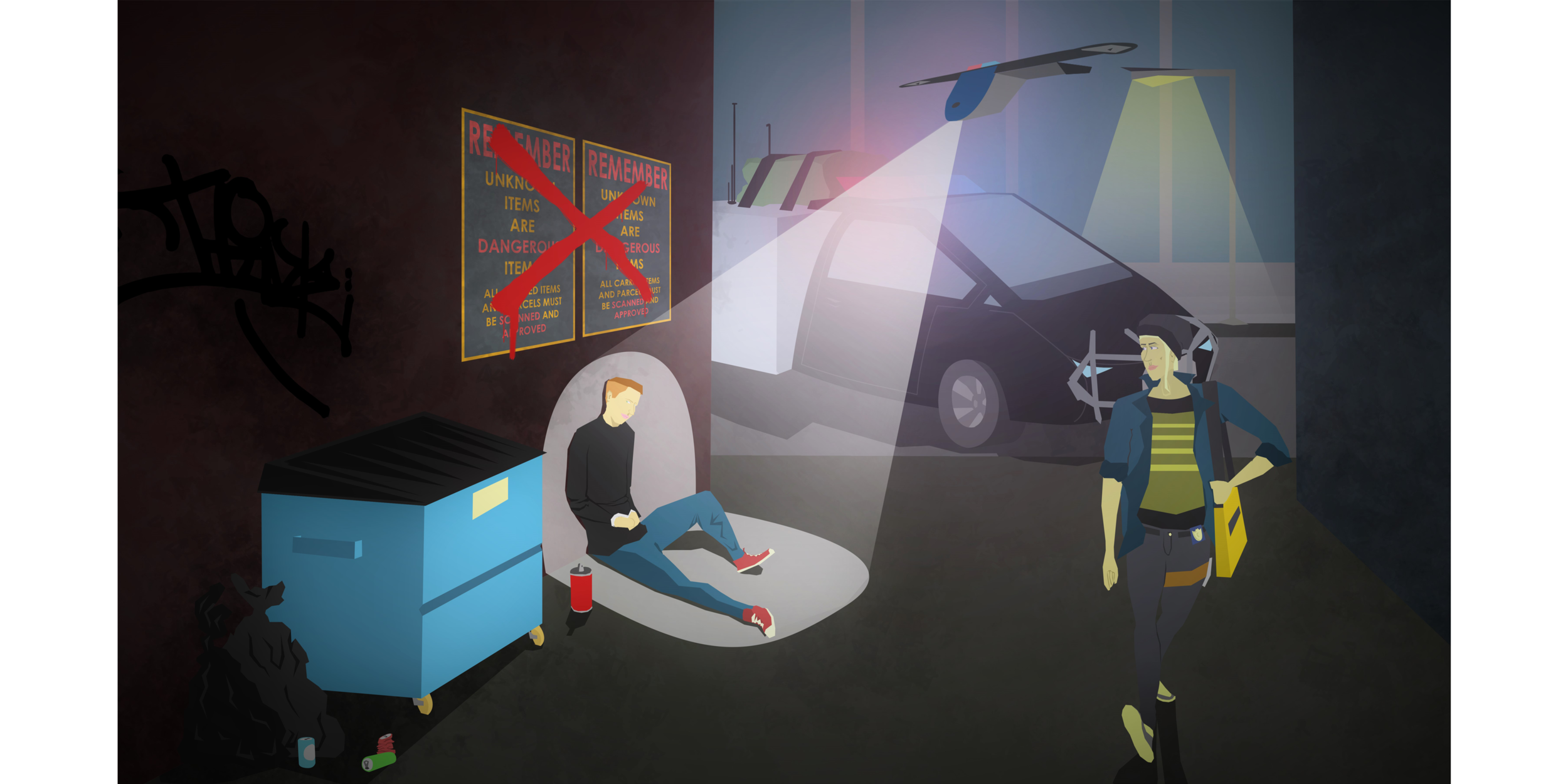
Concept art generated for a dystopian sci-fi thriller. Who needs police officers when you have drones to do your dirty work?

Concept art generated for a dystopian sci-fi thriller. It isn’t a good getaway unless you break a few windows.

A color and texture study used to determine art direction for a short film.

A creature design sculpted in ZBrush. Based on a hybrid of a polar bear and armadillo.

A semi-fictional rendering of my workspace (and bedroom) conveying personal interests.

This poster was created for the Santa Monica School District Art Exhibit in 2013. This design was inspired by street art and graffiti stencils. This design was selected to represent the exhibit and posted city-wide to advertise the event. I also got a free sandwich out of it.

Inspired by the work of Laszlo Moholy-Nagy. Multiple exposures layered together to create a composition.

Inspired by the work of Laszlo Moholy-Nagy. Multiple exposures layered together to create a composition.
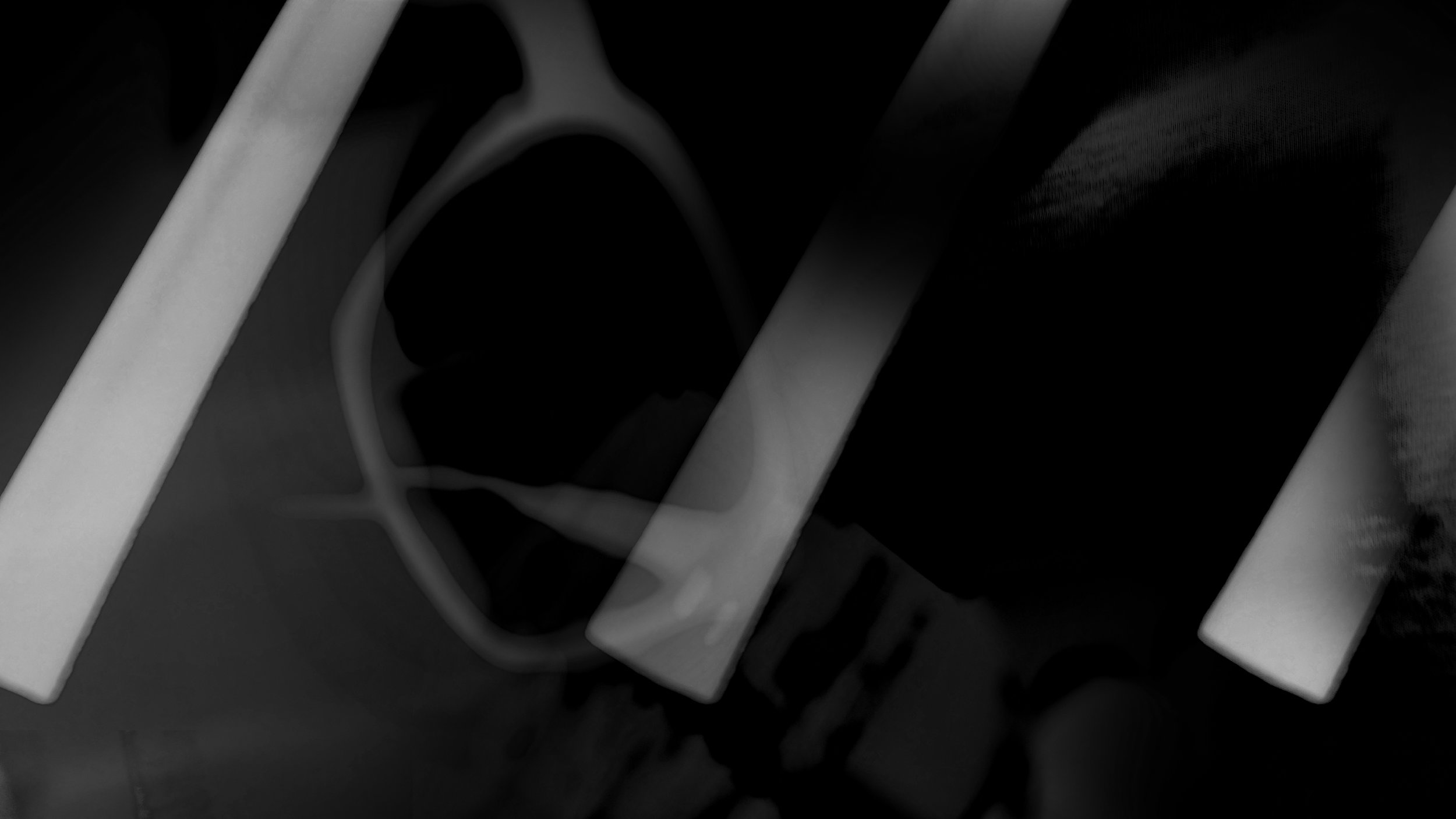
Inspired by the work of Laszlo Moholy-Nagy. Multiple exposures layered together to create a composition.

Early pre-production concept art displaying a potential set layout and color grade.
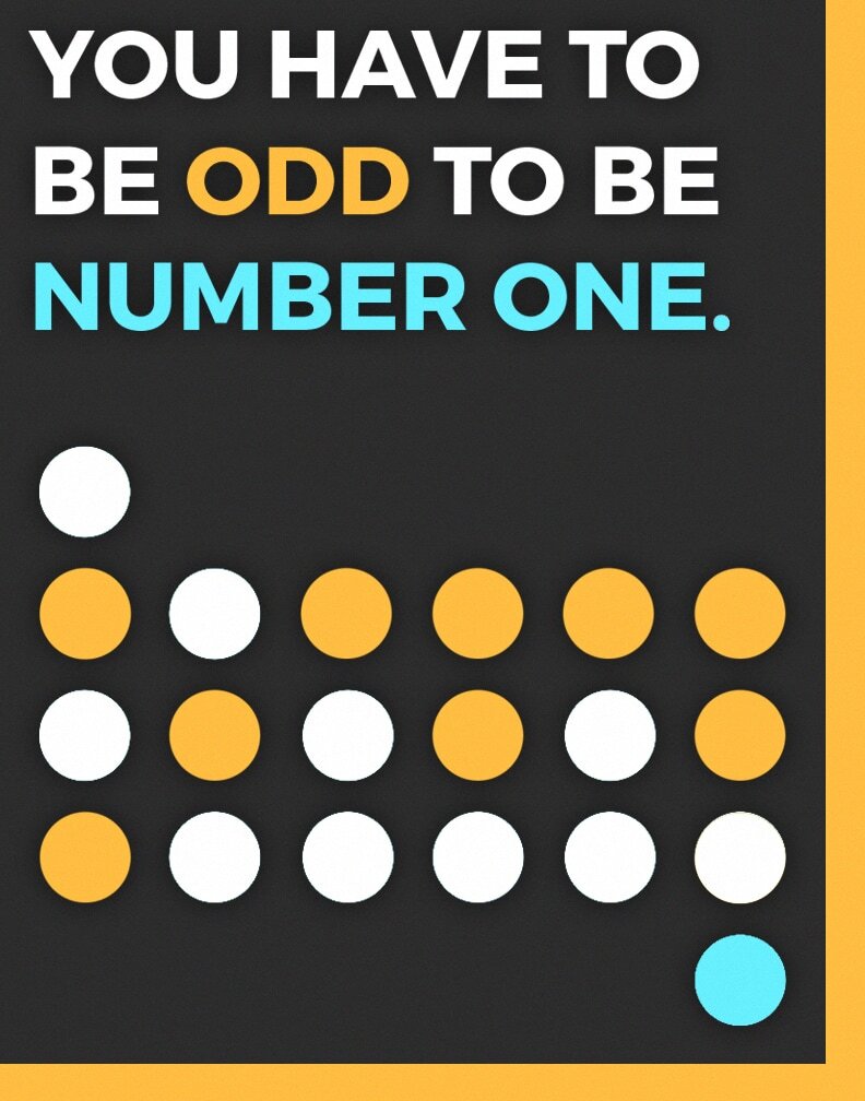
A PSA poster prompted by iconography of braille. The orange dots spell “odd”, serving as both an aspect of the design and the language of the message.

This template was designed to be used for concert promotions. It was distributed as a blank template with placeholder text for customers to fill in as they please.


A tribute to everybody’s favorite wall-crawler
A quick illustration based on someone seen in a bar window
A character / texture study based on a bear and romanesco broccoli. Who knew food could be so fractal?
Interior study focused on capturing the warm colors of summertime.
Character concept created as part of a production pitch. This guy may be made of metal, but he loves a cool jacket.
Character concept created as part of a production pitch.
Concept art generated for a dystopian sci-fi thriller. The city may look pretty, but it hides a lot of dark secrets.
Concept art generated for a dystopian sci-fi thriller. Who needs police officers when you have drones to do your dirty work?
Concept art generated for a dystopian sci-fi thriller. It isn’t a good getaway unless you break a few windows.
A color and texture study used to determine art direction for a short film.
A creature design sculpted in ZBrush. Based on a hybrid of a polar bear and armadillo.
A semi-fictional rendering of my workspace (and bedroom) conveying personal interests.
This poster was created for the Santa Monica School District Art Exhibit in 2013. This design was inspired by street art and graffiti stencils. This design was selected to represent the exhibit and posted city-wide to advertise the event. I also got a free sandwich out of it.
Inspired by the work of Laszlo Moholy-Nagy. Multiple exposures layered together to create a composition.
Inspired by the work of Laszlo Moholy-Nagy. Multiple exposures layered together to create a composition.
Inspired by the work of Laszlo Moholy-Nagy. Multiple exposures layered together to create a composition.
Early pre-production concept art displaying a potential set layout and color grade.
A PSA poster prompted by iconography of braille. The orange dots spell “odd”, serving as both an aspect of the design and the language of the message.
This template was designed to be used for concert promotions. It was distributed as a blank template with placeholder text for customers to fill in as they please.
